Biweekly Update - 10-9-2022 (The big reveal, UI rework, plans for v0.46)
(The following is (mostly) a copy-paste from our bi-weekly public update post on Patreon! If you like what you see, you can try a free demo of the game on our itch.io by clicking here! If you enjoy the game, please consider supporting us on Patreon! We couldn't make this game without our supporters!)
Hey everyone, time for another CPE development update! This is going to be another relatively quick one, but not due to a lack of excitement!
Before we get into the real meat and potatoes of the update, I'll quickly just give you a rundown of what everyone has been working on. Puffernutter has been hard at work on the UI overhaul, to make sure it gets done soon enough that we can implement it for the next beta release. The current UI is EXTREMELY broken in the new screen resolution, so rather than putting a bunch of work into making it look right only to rip it out and replace it with the new UI next update, we're just focusing on getting it done now. Orexius has continued work on the new BE Vines animation, but he's also been focusing on gameplay animations, specifically ones related to the thing I'VE been working on, which brings me to "the big reveal".
I spent most of my work hours these past two weeks on the thing I teased during our last biweekly update, and I've progressed far enough with it that I'm ready to fully reveal it. We've been working on a lot of overhauls (environment art, lighting, UI, story, etc), but most of those are visual changes, nothing too crazy on the gameplay front.. but like I said in the last update, this one is big - a complete overhaul to one of the fundamental parts of CPE's gameplay. Without further ado..
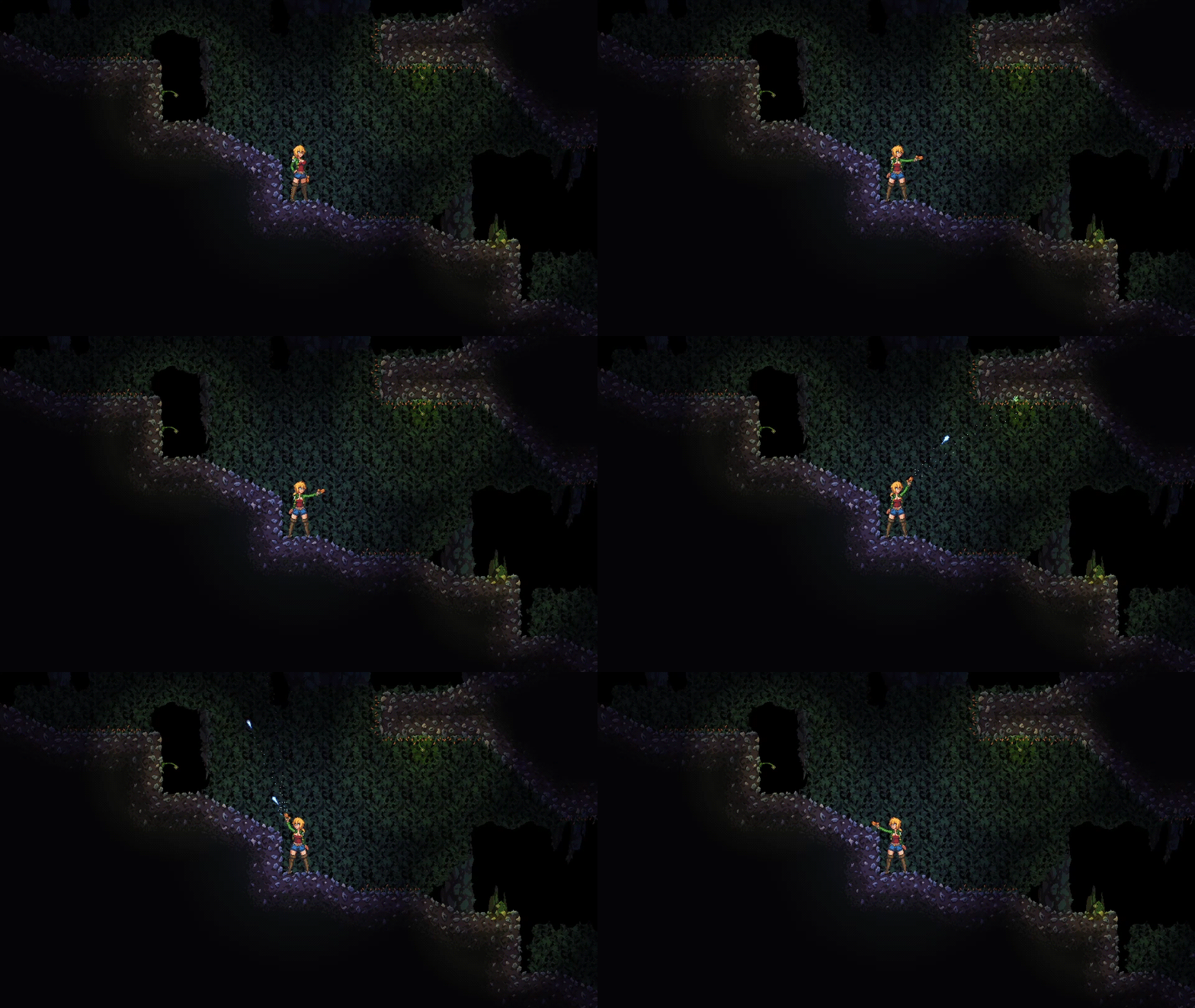
I'm proud and excited to confirm that Crisis Point is getting full 360 degree aiming, and full gameplay mouse support along with it!
Those of you that have been following CPE for a while might know that I've addressed this idea a few times, and declined to add it. There were a few reasons for that; feature creep, difficulty of implementation, the possibility of enemies being easily cheesed by sniping them from their blind spots, etc. Now that we've been overhauling so many aspects of CPE though, I revisited the idea, and decided that none of those reasons were good enough to justify not adding it. Samus Returns and Metroid: Dread both proved that 360 degree aiming feels amazing in a gun-focused metroidvania, and there are so many other excellent entries in the genre that felt so modern compared to CPE's retro 8-directional aiming. After spending a lot of time thinking about it, I felt like I was doing the game a disservice by not modernizing the gameplay while we were already upgrading so many other things, so here we are!
There are a LOT of small gameplay tweaks that will be coming along with this, and we'll likely be polishing and tweaking it for a while, but I fully intend to have an early version of this included in v0.46 when it comes out. We've decided to narrow down the scope of v0.46 so we know exactly what to focus on, and I'll detail that at the end of this post; for now, let's talk about the other thing I wanted to show off this week, the UI update!
A quick preface: none of these images are finished yet! We're still tweaking layouts, and we haven't even started messing with colors or aesthetics yet, which is why all of them are in greyscale, so don't take any of this as finalized images.
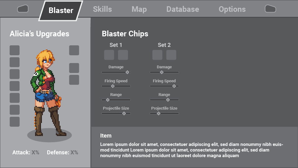
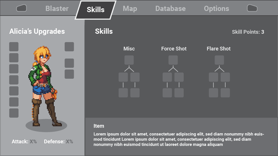
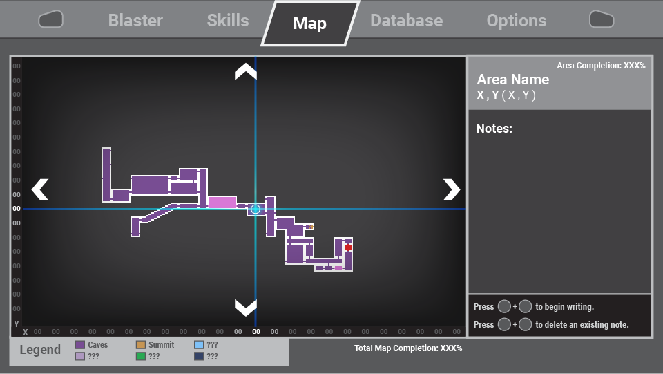
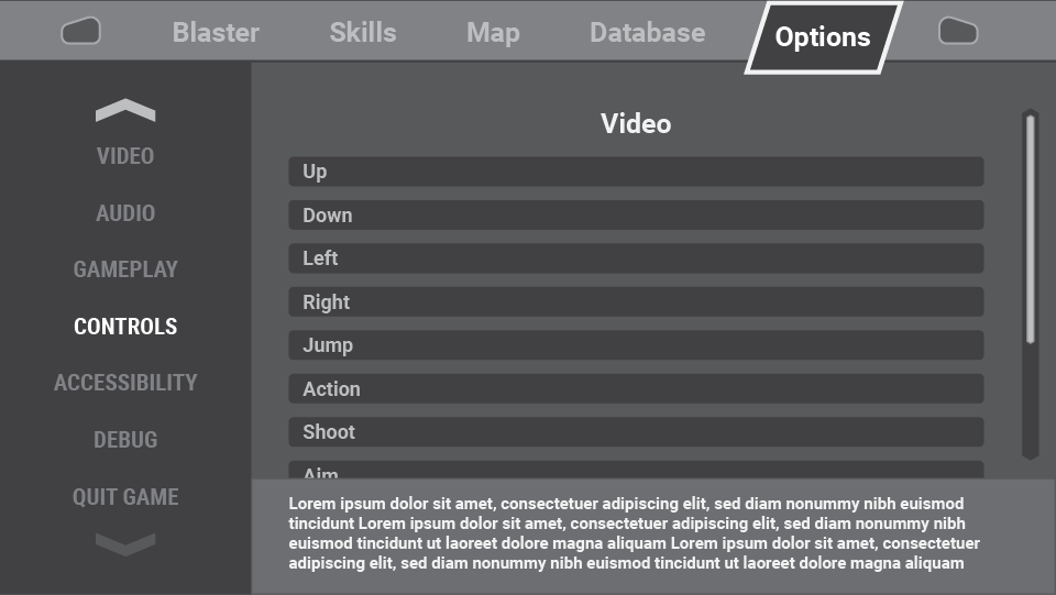
As you can see, we're not just doing a simple visual update, the pause screen is getting a total overhaul from the ground up! The old menus were cramped, and only utilized a tiny part of the screen space, which made them feel even more claustrophobic. They also caused a lot of issues when it came to adding in new sections, since there just wasn't room for it. The new UI is being designed for maximum modularity, so it won't be a huge pain to update them as time goes on. We're also considering a vector graphics aesthetic for menus specifically, for the sake of clarity and readability; though like I said in the preface, we're focusing on function over aesthetics right now, so we might still use stylized pixel art for menus, it just depends on what feels right.
That's all the major stuff for this update, hopefully you're as excited as I am about it! Before I go, let me just update you guys on exactly what v0.46 is going to have.
Crisis Point: Extinction v0.46 plans
- New 360-degree aiming system, along with full gameplay mouse support
- Completely overhauled lighting engine, along with other small special effects improvements
- Increased screen resolution, bringing the game to a more modern 16:9 aspect ratio
- Updated UI with improved functionality
- A handful of updated H-scene animations, such as the Slime and BE Vines animations
- The usual bug fixes and such (and probably some new bugs to go along with the new features, if we're being honest)
So that's everything we plan to add in v0.46. We won't be adding any "new" content, like I've mentioned before; our team's goal right now is to lay all of this groundwork, so that once we do start working on new content again, we'll have all the tools we need to really crank it out. To that end, once v0.46 is complete, I'm going to fully shift my focus towards finishing our level editor, since that needs to be done before we can work on updating the game's level design and artwork.
Alright, that's it for this biweekly update! If you have any questions about the stuff I talked about, feel free to leave a comment - these are some pretty dramatic changes, so I'm happy to answer anything y'all have to ask. Thanks for reading, and we'll see you again in the next update!
Get Crisis Point: Extinction 2023 Public Demo
Crisis Point: Extinction 2023 Public Demo
Adults-Only 18+ Metroidvania H-game
| Status | In development |
| Author | Anon42 |
| Genre | Platformer, Action |
| Tags | 2D, Erotic, Female Protagonist, Metroidvania, NSFW, Pixel Art, Side Scroller, Singleplayer, Space |
| Languages | English |
| Accessibility | Configurable controls |
More posts
- Update posts 6-11-23 through 8-27-23Aug 28, 2023
- Update posts 3-21-23 through 5-21-23May 21, 2023
- Crisis Point: Extinction 2023 public demo release!Mar 05, 2023
- Bi-Weekly Update - v0.46 hotfix 5, status updateMar 01, 2023
- Crisis Point: Extinction v0.46 release for $10+ Patrons! (NSFW Trailer)Feb 02, 2023
- Weekly Update - 1-22-2023 (Final testing!)Jan 23, 2023
- Weekly Update - 1-15-2023 (Approaching the finish line)Jan 17, 2023
- Weekly Update - 1-1-2023 (New years status update)Jan 03, 2023
- Biweekly Update - 12-4-2022 (Progress report)Dec 05, 2022
- Biweekly update - 11-7-2022 (More UI (now in technicolor!), streams incoming, ge...Nov 08, 2022
Comments
Log in with itch.io to leave a comment.
Hi, long-time fan here, getting caught up after quite a while away...
Glad you're doing well and progress is going strong!
Love love love the resolution increase and lighting upgrades, only thing I'm sad to see in is that the slime animation lost 2 frames - imo it makes the motion a little choppier. And to my untrained eye yours maybe had more color/shading/something... her boobs and less transparent slime lost a little magic in the change. But with how so much is getting reworked maybe in game it will look totally different! So don't mind me rn. I plan to rejoin Patreon ASAP & check things out more fully, thanks so much for all you do!!
P.S. also I stan pixel art menus, they're unique and gorgeous, although readability is important and was tough sometimes with the old resolution. Maybe the new res would be enough that pixel art could be epic and readable too? But vector's probably easier to update and change over time. So pros & cons either way for sure.
Hey, thanks for the kind words, I'm glad you like how things are shaping up!
Good news is, you've got the slime scenes mixed up - when I shared them a few updates ago, it was the new scene first, then the old scene, so the one you liked more IS the new scene. More frames, better detail, all that good stuff you noted!
Words cannot express how full of joy I am to be wrong rn. Thank you very much!! I'm even more excited now!! You rock and your work does too (with full kudos to your wife and cats and business associates as well! 💘)