Crisis Point: Extinction 2023 Public Demo
Bi-Weekly Update - 8-14-2022 (More backgrounds, MAJOR lighting engine overhaul!)
(The following is (mostly) a copy-paste from our bi-weekly public update post on Patreon! If you like what you see, you can try a free demo of the game on our itch.io by clicking here! If you enjoy the game, please consider supporting us on Patreon! We couldn't make this game without our supporters!)
Hey everyone, welcome to this week's development update! Fair warning, there won't be as many visuals this week, but we still have some exciting stuff to show off! Puffernutter has been focusing on polishing assets to a game-ready level rather than pumping out fast concepts like last update, Orexius is still finishing up the slime H-scene and working on a rough animation for a new gameplay feature I'm surprised we haven't added yet, and for my part, I had a bit of an odd pair of work weeks, but the result is really exciting. I'll save the details for the post itself though, so without further ado, let's get into it!
First off, let's look at Puffernutter's work.
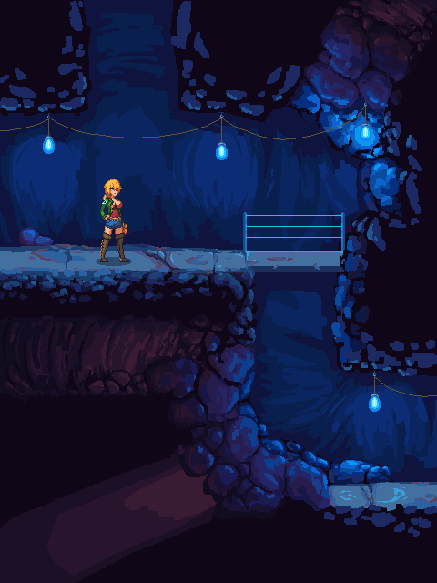
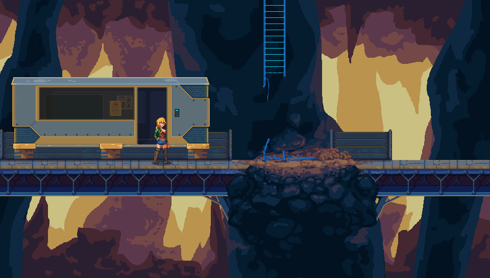
These are the two environments she was focusing on, and both of them are near-final asset quality now. There's still parts of each scene that aren't quite complete, especially in the first one, but you can see a clear difference if you compare them to the backgrounds we talked about last update!
In general, while working on these new environments, we have one major goal in mind: to bring the individual asset quality down a bit, while bringing the quality of the scene as a whole way up. That may sound counterproductive, but I think the images speak for themselves, if you compare it to the way CPE looks right now. In the past, we've put a lot of effort into making 1 tileset and then polishing it as much as possible - individual assets in the tileset look great, but it takes a HUGE amount of time to bring them up to that level, and once you put it all together in a scene, most of the work we put into them just gets lost. That's been a huge struggle for us, learning what point is "good enough" vs where it's worth putting the extra effort; you can theoretically spend an infinite amount of time polishing a single thing, but at a certain point you're essentially wasting time that could be spent somewhere else, and time is probably the most valuable asset when making a game.
This is something I've really started to learn while paying attention to other games, especially ones made by studios way bigger than us with way more money. If you're looking for it, you can find tons of places where they "cut corners" as it were, but it's done intelligently and with purpose. The end result is that the cut corners are placed in areas where you don't even see them, and it doesn't take away from the final product at all, letting them focus on the areas that DO need that polish. I realize it may come across as lazy at a surface level, that was my view on the matter until more recently, but after spending so much time on CPE's background assets, only to have Puffernutter come in and (in just two weeks) throw together environments that look WAY better than anything we have, it really made the point hit home for me.
One last note about the second image specifically - you may notice a ladder placed in the center of the scene, and that's because we're going to be adding ladders to the game! That's the other animation Orex has been working on, and I'm surprised we haven't done it already honestly. The level design in the early parts of the game was tricky to work with because of how few tools Alicia has for vertical ascension, which lead to me making the levels pretty claustrophobic. Now that we're updating the background art, we're going to do another pass over the level designs themselves as well, and ladders will be super helpful for making verticality easier to work with. Plus, it just makes sense that the humans would've set up ladders to help them get around.
Now, let's get into what I worked on. After putting together the last update post, I wanted to create a small tool for Puffernutter to basically import a background she's working on, and then add the CPE lighting engine on top of it, so she could tune the colors for what they would actually look like ingame. I decided the obvious solution would be to add it to the level editor, since it would be helpful for testing the lighting while designing levels as well. So I got to work late Sunday, and by late Tuesday I had made.. exactly 0 progress. Not because I wasn't trying, mind you, but because I could not for the life of me get the lighting engine to work in another project. I copied everything over directly from CPE, but it's been so long since I messed with the lighting engine that I just didn't even understand it anymore, thanks to the complete lack of notation. I was a total amateur when I started CPE and I'm still paying for those mistakes all these years later, haha.
So, after basically wasting an entire work week, I reconsidered the angle I was attacking it from. CPE's lighting engine isn't terrible, but it is more obtuse than it needs to be, and lacks some features that I would love to have but wasn't skilled enough to pull off back then, like proper colored lighting. I've learned a lot over the years though, and I had some ideas. After thinking things out over the weekend, I started experimenting last Sunday - and in contrast to the slow failure of the previous week, I had gotten enough done by the end of that very first day to know that all of my ideas and theories worked exactly as I hoped.
Long story short, Crisis Point's lighting engine is in the process of being completely overhauled right now. It's nowhere near done being implemented yet - the lighting itself is done and works perfectly, since it was easy to set up a new lighting system in a new project, but actually ripping out CPE's old lighting and replacing it is a far bigger task, especially when I don't even remember how the damn thing is put together. That being said, I did take the time to put together an example:
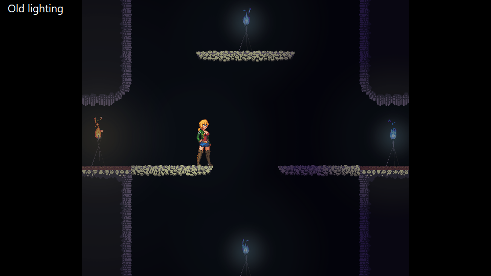
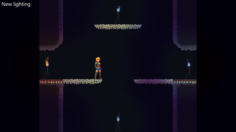
(Note that this example was not put together in CPE itself, since I'm still working on implementing the new lighting; I took a screenshot of this spot with and without lighting, and threw the screenshot into the project I was testing the new lighting in. This is pretty close to how it will look ingame, but there might be some differences - the new system plays off of the environment better, so more complex scenes with walls and such will benefit even more than this, and it also works really well with different-colored lights in a single scene, so you can expect an even bigger difference as we add more lighting pieces into the environment!)
As you can see, the difference is staggering. In addition to the tint of the darkness itself, each colored light source also tints the area around it, unlike before where it was just a simple overlay sprite. There's still a lot of tweaking we can do, like I think the fires do need a little more going on now that they don't have the overlay sprite anymore, but that's something we can work on.
To dive into this a little bit more, CPE's lighting was previously split into two parts. The first was the most important part; in each area, the game screen was drawn twice, first normally and then a separate version above that, with the colors tinted and darkened based on how dark the area was. Then, the "lights" essentially just cut away from that second darker image, which made the normally-lit version behind it visible through the areas where there was light. The second part was technically "colored lighting", but it's hardly even worth talking about - all I did was overlay a partially-transparent colored orb over things that I wanted colored, which is the most half-assed way to handle that, on top of doubling the required draw calls.
Now, this new system doesn't require the layering of the old system, and the colored lighting is a baked-in part of the lighting itself, so it doesn't require any additional draw calls or anything. It looks better, is simpler to implement and understand, AND it's more efficient! We have so much more freedom over the colors and shape now, because all of the lights are tied to gradient maps, which allows us an infinite amount of customization - for example, the orange light in the screenshot up above is using this gradient map:

The center of the light is mapped to the right side, while the outer edges are on the left side, and it uses that to tint the image. Pure white means it just draws the color normally, so the very center of the light where it's at its brightest is untinted, just like you would see in a real light. If we want the full light to be tinted, we can easily just give it a different gradient map without any pure white on it, and I can even add animation to the lights by changing the shape of the gradient, and shifting the vertical position the light pulls from over time. The options are quite literally infinite, and we'll be tinkering with it a lot to make the lighting look as good as we can!
Alright, that's pretty much all I have for today. I hope you guys are as excited about this new lighting as I am; between the new resolution, the new lighting engine, and Puffernutter's new background work, Crisis Point is about to get one hell of a makeover, and I can't wait to share more of it with you all! See you again in the next update!
Comments
Log in with itch.io to leave a comment.
slow and steady beats quick and clumsy. great work takes time.
I have a very similar philosophy as an artist. The more time you spend on something, the better it will generally be, and the only way to increase how much time you have is to use it efficiently.
That's why I try to draw fast. The sooner I finish my roughdraft, the more time I have to deal with any problems I run into and improve on my design. If I realize I'm not happy with the direction I'm going, less time was wasted on it, and sometimes taking your time while doing too good of a job ends up hiding the problems with your initial plan until you have reached a dead end.
It's really easy to waste time without realizing it when you work at a comfortable pace, and I find that I'm able to make good art much more quickly than I believed myself capable of. (also, when it comes to art, being too much of a perfectionist can limit your creativity)
Planning and thinking ahead definitely has its place, but I find myself doing a wasteful amount of it. You've gotta know your own tendencies and capabilities and adapt your workflow accordingly. Everything has a limit on its usefulness.
TLDR: No shame in cutting corners, not all time spent is of equal value.
Your quote at the end is EXACTLY right: not all time spent is of equal value, thank you for summarizing my ADHD rambling into a few words lmao. It's a lesson I've taken embarrassingly long to learn, but we're getting there, and it's always good to hear other creative folks dealing with the same things!
Look super amazing!!