Bi-Weekly Update - 7-31-2022 (Backgrounds, NSFW slime H-scene update, and resolution/refactoring work)
(The following is (mostly) a copy-paste from our bi-weekly public update post on Patreon! If you like what you see, you can try a free demo of the game on our itch.io by clicking here! If you enjoy the game, please consider supporting us on Patreon! We couldn't make this game without our supporters!)
Hey everyone, and welcome to the first "normal" update we've had in a long time! As you all know, our team - specifically myself, Orexius, and Puffernutter - have finally been able to get back to work, after planning a schedule for the household. The scheduling has turned out to be a godsend for all of us, and we've all managed to be pretty productive these past two weeks! I've still had a day or two where it's a struggle, but it's a far cry from how things have been this past year.
I don't want to spend too long talking about personal stuff, since we have a REAL update to get to, but it's caused a huge improvement in my mental state, as well. I was already doing way better after spending so much time working on my mental health, and getting back to work feels like the last piece of the puzzle finally falling into place. Having CPE gives me a creative outlet, and a purpose and fulfillment that is otherwise lacking in my day-to-day, and I'm more confident than ever that now was definitely the right time to get back to it. Instead of work feeling like a drain, it's invigorating again, and I haven't felt that way in a long time! I really can't thank you all enough for sticking with us this whole time. My therapist has even recommended going down to visits every other week instead of every week, because of how much I've improved, and it's all thanks to you guys giving me the time and space to work on myself!
Before I start the post proper, just a heads up - as part of the new schedule, we'll be posting updates on Sunday again, so expect to see us then instead of Saturdays like we were doing for a while. And since everybody seemed okay with me trying updates every other week, we'll be trying that out as well and seeing how it goes, so you can expect to get 2 development updates a month at minimum. Now, without further ado, on to the update!
For starters, let's talk about my work, which was decidedly the least glamorous part. Because of the inconsistent way I was working on the game for a while, there's a lot of things I was working on that I just never finished. My first priority now that we're back to it is going back and finishing all of those things; it's been kinda awkward, figuring out exactly where I was with all of it (melee attacking any enemies caused the game to crash, as one example of how borked things were), but I've been making good progress. The main thing I'm focused on right now is the upgrade to 960x540 resolution, up from the 640x480 the game used previously. I don't remember if I've ever shown off the difference in screen size, so here's a quick comparison shot:
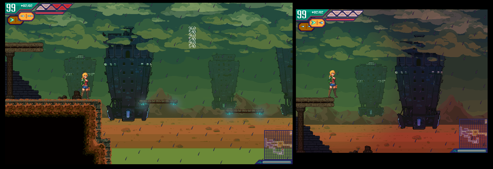
Please forgive the graphical issues and floating debug numbers, it's very much still a work-in-progress! Believe me when I say that this area used to have way more visual bugs than there are now. Playing the game with this new resolution is honestly a revelation, exploration and combat both feel so much better. The biggest negative is that the game's areas were designed around that 640x480 resolution; after some deliberation, I've decided to keep the 640x480 area designs where possible so I don't have to go updating every single level in the entire game, and if an area is too small to fill up the new screen resolution, it'll just be centered on the screen with black bars on either side.
I'm really hoping we'll be able to include this resolution upgrade in the next playable update, and I'm making good progress - I've fixed over half of the issues I have written down so far, but there are still a lot of things that need to be done. Pretty much every area's background was designed for 640x480, so all of them need to be fixed (and the code for them was terribly inefficient, so updating them has taken longer than you might expect), but the most daunting thing is probably updating the UI. I've never been completely happy with CPE's UI/UX, and now that we have so much more space to work with, we plan to revisit and redesign some of it rather than just updating graphics for the new resolution.
Aside from that I've been doing some code refactoring for how the game handles hitboxes - a boring task, but it'll make future development easier - and I'm still tinkering with the game's story. I especially want to edit down some of the early cutscenes to be a bit shorter and get players into gameplay quicker, doubly so now that we have systems for optional dialogue, so I can move some of the less necessary exposition into optional conversations. I still really want to get work done on our level editor as well, but unfortunately it's going to take a bit of a backseat right now, since I need to focus on finishing all this half-done stuff so the game's not completely broken anymore for our next release. (And just as a reminder, the level editor isn't something I'm releasing publicly - as fun as it would be, the way it works requires direct access to project files, so unfortunately it wouldn't be usable by anyone outside of the team.)
Next up is Puffernutter's work, and this is the most exciting thing in my opinion! Puffernutter (my wife, for those of you not in the know) has been working on the game's background art for a while, but she usually doesn't have a lot of free time thanks to her freelancing work, so she hasn't been able to work on CPE too much. Now that we have our schedules laid out, though, things have been a lot more consistent, and we have some really exciting things to show for it! Feast your eyes:
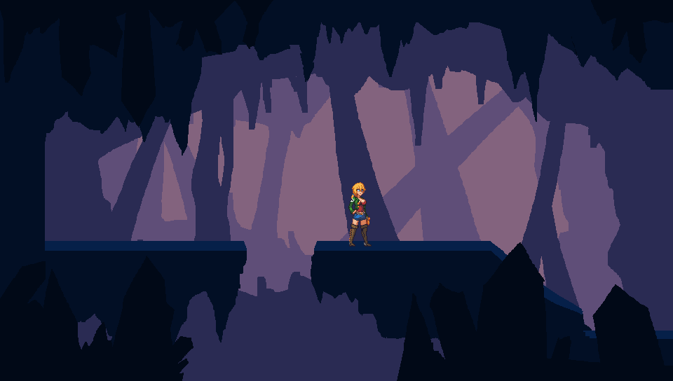
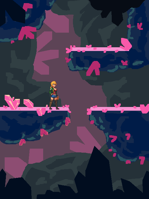
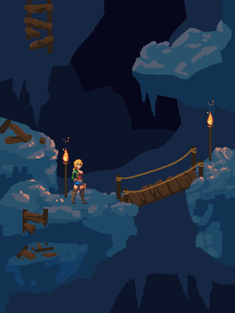
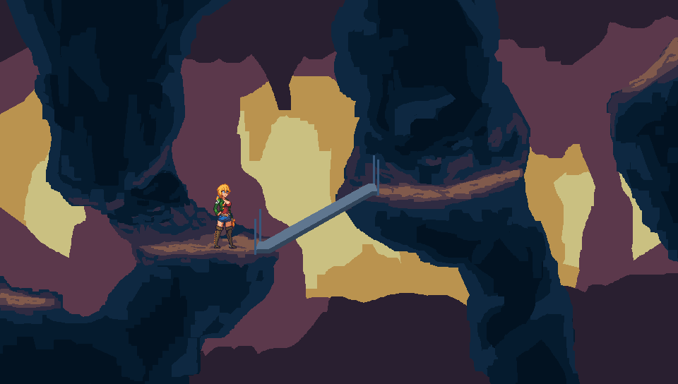
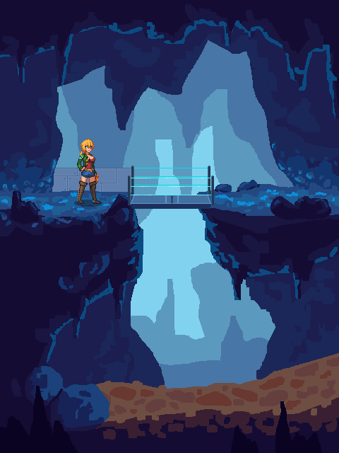
These are all nowhere near final asset quality, to be clear. All of these were drawn in a single work day, essentially acting as concept art, and it's not even a guarantee that we'll be using all of them - but there's still a lot to talk about here!
One of my biggest problems with Crisis Point has always been our background art. None of it is explicitly bad, it's just often very boring, and areas blend together no matter how much I try to include unique level geometry. It's a mixture of the lack of unique areas and setpieces, and way too much focus on individual asset quality rather than scene composition as a whole. In my opinion, every single one of these pieces of concept art looks better than any of the ingame scenes, even though they're much less polished, just because they're so much more interesting to look at as a whole. There's a couple major things here that contribute to that, and I'll talk about each of them.
Firstly, the perspective in CPE currently is a perfect side-on camera view, meaning that the player can't see the floor or ceiling of any areas. That can help with creating clearly defined collision boundaries, which is good for gameplay, but it also removes entire surfaces from view and makes it a lot harder to make interesting tilesets. So, we're going to be updating every tileset in the game, at least a little bit; even in the areas where we're relatively happy with the background art (like the Summit), we're going to update tiles to add some perspective to the floors, like you can see in all the concept art above. We'll be doing our best to ensure that level collision is still easy to understand of course, but since we're only adding perspective to the floors, I don't expect to have much difficulty.
Second is that we want to start creating a lot more bespoke assets for individual rooms, rather than everything being shared on a tileset - for example, having a specific rock formation that only shows up one time, in a single room. Not only does that help with keeping the game interesting to explore and look at, but it also helps create landmarks in your memory, so you can more easily remember areas you've been to previously. That can be especially helpful for Metroidvanias, when you get a new powerup and need to figure out where to use it. There's a few points in CPE where it's easy to get lost, and I'm hoping more unique assets will help with those moments by making every part of the game more memorable.
Lastly, kinda related to the above, is that we're going to be kinda splitting each area of the game into sub-areas - we already do this to a small extent, like with the building interiors and outdoors areas in the Summit, but we plan to take it much farther. Each of the concept images above were made for the Caves, as an example; rather than one consistent tileset used across an entire biome, there will be multiple sections that each share a similar feel, but ultimately have a lot of visual uniqueness to them. This is all pretty obvious stuff, and most Metroidvanias before us have handled it much better than we have so far. It's something I always wished we could do, but we just never had the time to create enough assets to make it happen. The very nature of a Metroidvania is exploration, though, and if a world isn't interesting to explore, the whole thing kinda falls apart, so I'm excited to finally be able to make improvements on that front!
That's all for the background art for now, but I can't wait to be able to show more off in the future, CPE's about to get a lot nicer to look at!
Last thing to talk about today is Orexius's work. He's been working on a few animations, like a unique animation for sliding down steep slopes (right now we're just reusing another one of Alicia's animations for that), but the one I'm sure you guys would be most interested in is the updated Slime H-scene. It was one of the first H-scenes made for the game, done by me before Orexius was even around, and much like the other early H-scenes, it just doesn't match up with the quality of the game now.
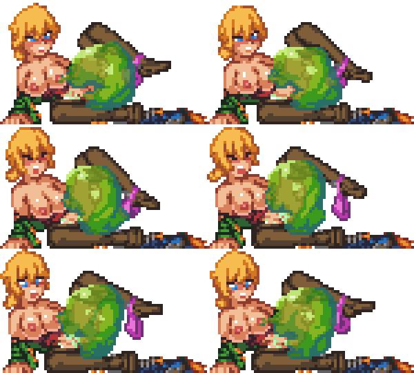
For comparison, this is the old animation, so you can see how much it's been improved:
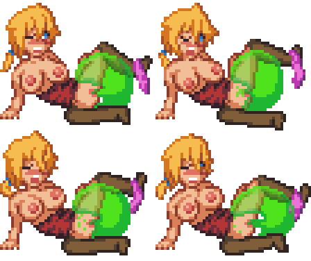
He's done a great job on it if you ask me, the improvement is dramatic!
Alright, that's it for us this update! We're still having internet problems, so unfortunately I can't start up streams again yet, but hopefully we'll be able to get that figured out soon. Thanks for reading, and I hope you're as excited for more CPE content as I am to finally be delivering it! We'll see you again in another two weeks!
Get Crisis Point: Extinction 2023 Public Demo
Crisis Point: Extinction 2023 Public Demo
Adults-Only 18+ Metroidvania H-game
| Status | In development |
| Author | Anon42 |
| Genre | Platformer, Action |
| Tags | 2D, Erotic, Female Protagonist, Metroidvania, NSFW, Pixel Art, Side Scroller, Singleplayer, Space |
| Languages | English |
| Accessibility | Configurable controls |
More posts
- Update posts 6-11-23 through 8-27-23Aug 28, 2023
- Update posts 3-21-23 through 5-21-23May 21, 2023
- Crisis Point: Extinction 2023 public demo release!Mar 05, 2023
- Bi-Weekly Update - v0.46 hotfix 5, status updateMar 01, 2023
- Crisis Point: Extinction v0.46 release for $10+ Patrons! (NSFW Trailer)Feb 02, 2023
- Weekly Update - 1-22-2023 (Final testing!)Jan 23, 2023
- Weekly Update - 1-15-2023 (Approaching the finish line)Jan 17, 2023
- Weekly Update - 1-1-2023 (New years status update)Jan 03, 2023
- Biweekly Update - 12-4-2022 (Progress report)Dec 05, 2022
- Biweekly update - 11-7-2022 (More UI (now in technicolor!), streams incoming, ge...Nov 08, 2022
Comments
Log in with itch.io to leave a comment.
It's good to hear you're doing better! I've loved everything I've played of this game.
Since you're updating the UI anyways, can I bring up something that's bugged me? There's a lot more emphasis on how far through your health containers (I forget their actual name) compared to the number of health containers you have left; this is opposite of what I would expect, especially since later enemies do so much damage.
Thanks for the feedback! To make sure I'm understanding you right, you're basically asking for the health UI to put more emphasis on your total health rather than how much you have left in your current "health container", yeah? If so, we'll definitely keep that in mind and try to find a better solution. If not, can I ask for some more elaboration on what exactly you mean?
(Sorry for the late reply) Yeah, that's exactly right. When I need to get information from the health indicator quickly, I'm usually trying to see "how many more hits can I take?" I think breaking it down into "number of health containers" is fine, but it would be nice if the player's vision was drawn to the more influential number first. My first thought was just making the "health containers" number bigger than the "container remaining percentage", but there's probably better ways to do it (visualizing the cells like in metroid? an overall health meter? some sort of visual indicator on Alicia herself?).
(For context, the latest version I've played is the one you released publicly around the start of COVID, so I don't know of any changes you've made since then)
Gotcha, thank you for the input! I'm not entirely sure what we'll end up doing with the healthbar, but I'm not fully satisfied with it either, so it's definitely one of the things we'll be trying to address. I appreciate you taking the time to give feedback on it!
Already an amazing game, really excited to see how you guys continue to evolve it moving forward. Super happy to hear about your personal life progress, don't feel shy about sharing if you want to!